Version: 3.0.0
TextEdit

- Lumin
- iOS
- Android
Description
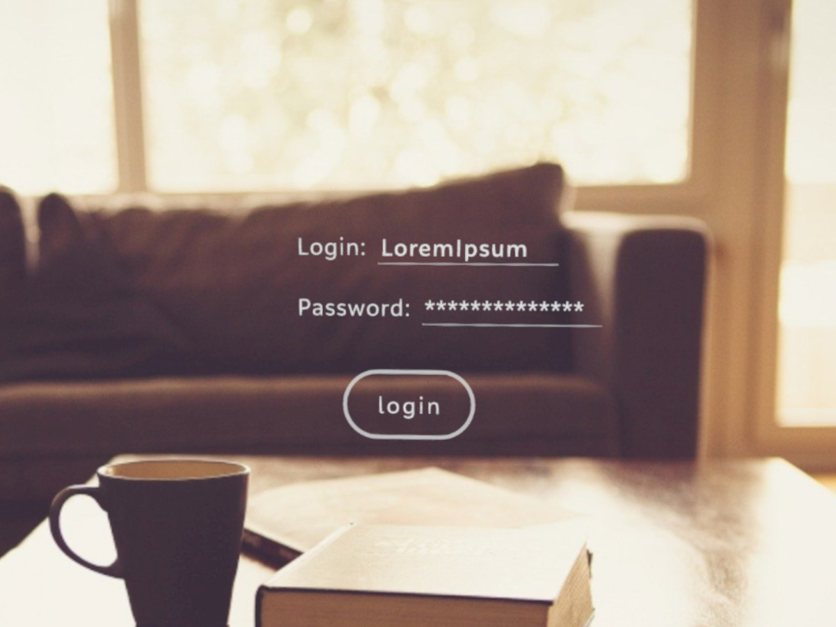
The TextEdit component creates an editable text box for text entry on a single or multiple lines. The last line includes a white underline to clearly delineate that the text box is editable. Include a UTF-8 compatible font in your project if you expect characters outside of the ISO Latin-1 character set.
Example
import React from 'react';
import { TextEdit, LinearLayout, Text, Button, View, Prism, Scene } from 'magic-script-components';
export default class MyApp extends React.Component {
render() {
return (
<Scene>
<Prism size={[1, 1, 0.2]} >
<View name="main-view" alignment={'center-center'}>
<LinearLayout
orientation='horizontal'
defaultItemAlignment='center-center'
defaultItemPadding={[0.01, 0.01, 0.01, 0.01]}
localPosition={[-0.2, 0.1, 0]}
>
<Text textSize={0.05} textColor={"#B5B5B5"} localPosition={[0.1, 0, 0]}>Login:</Text>
<TextEdit text='LoremIpsum' height={0.054} textSize={0.05} width={0.3} />
</LinearLayout>
<LinearLayout
orientation='horizontal'
defaultItemAlignment='center-center'
defaultItemPadding={[0.01, 0.01, 0.01, 0.01]}
localPosition={[-0.2, 0, 0]}
>
<Text textSize={0.05} textColor={"#B5B5B5"} localPosition={[0.1, 0, 0]}>Password:</Text>
<TextEdit password={true} text='secretpassword' height={0.054} textSize={0.05} width={0.3} />
</LinearLayout>
<Button localPosition={[0, -0.2, 0]} text='login' textSize={0.05} />
</View>
</Prism>
</Scene>
);
}
}
Common Events
Common Properties
Create Properties
| Name | Type | Default Value | Required | Description |
|---|---|---|---|---|
| text | string | n/a | N | The initial UTF-8 encoded text in the text box. |
| width | number | n/a | N | The width of the text edit area. |
| height | number | n/a | N | The height of the text edit area. |
Aditional (optional) parameters for create step.
| Name | Type | Default Value | Description |
|---|---|---|---|
| fontDescription | object | n/a | A 2D font that is a font rendered onto a planar image (whatever the format), as opposed to a 3D model of the glyphs or other graphical representation. |
| filePath | string | n/a | The font file from which the glyphs are loaded. By default this is assumed to be a relative path from the executable file. |
| absolutePath | boolean | false | Flags that the filePath is an absolute path name, instead of a relative path. |
fontDescription
{
advanceDirection: <string>,
flowDirection: <string>,
tileSize: <number>,
quality: <string>,
minAlpha: <number>,
}
AdvanceDirection options: AdvanceDirection
FlowDirection options: FlowDirection
Quality options: Quality
Element Properties
| Name | Type | Default Value | Description |
|---|---|---|---|
| charLimit | number | 0 | Sets the maximum number of characters allowed in the text box. 0 means no limit. |
| charSpacing | number | 0 | Sets the additional character spacing that is applied between characters. Note that 0 is the default spacing. |
| cursorEdgeScrollMode | string | n/a | Sets the cursor edge scroll mode for this text box. |
| style | string | normal | Sets the style of the Magic Leap font. |
| weight | string | regular | Sets he weight (i.e., thickness) of the Magic Leap font. |
| hint | string | n/a | Sets the UTF-8 encoded text for hint text. |
| hintColor | vec4 | n/a | Sets the text color of the hint. |
| lineSpacing | number | 1.0 | Sets the line spacing to adjust the distance between lines of text; e.g., use 1 for single-spaced text, 2 for double-spaced text |
| multiline | boolean | false | Sets whether the text box is in multiline mode or not. |
| password | boolean | false | Sets whether the text box is in password mode or not. |
| scrollBarVisibility | string | n/a | Creates and shows the scrollbar in the vertical direction. If a scrollbar already exists, only its visibility is affected. This function also attaches the scrollbar to the ScrollView that manages it. |
| scrolling | boolean | false | Sets whether scrolling is enabled or not. |
| scrollSpeed | number | n/a | Sets the scroll speed in scene units per second. |
| scrollValue | number | n/a | Manually scrolls the textEdit content position using a normalized value between 0 and 1. |
| selectedBegin | number | n/a | The first index for text selection. |
| selectedEnd | number | n/a | The last index for text selection. |
| text | string | n/a | Sets the UTF-8 encoded text. |
| textAlignment | string | n/a | Aligns the text to the left, center, or right or justifies it. |
| textColor | vec4 | n/a | Sets the RGBA color of the rendered text. |
| textEntry | string | n/a | Sets the current text entry mode of the text box. |
| textPadding | vec4 | n/a | Sets the padding around the text within the text edit area. This defaults to half the text size unless explicitly set. The padding order is: top, right, bottom, left. |
| textSize | number | n/a | Sets the text render size height in scene units. |
| fontParameters | object | n/a | Sets the font parameters, including syle, weight, pixel size, and tracking. This uses one of the default sets of Magic Leap font resources that support style and weight. |
fontParameters
{
style: string,
weight: string,
fontSize: number,
tracking: number,
allCaps: boolean
}