Version: 3.0.0
GridLayout

- Lumin
- iOS
- Android
Description
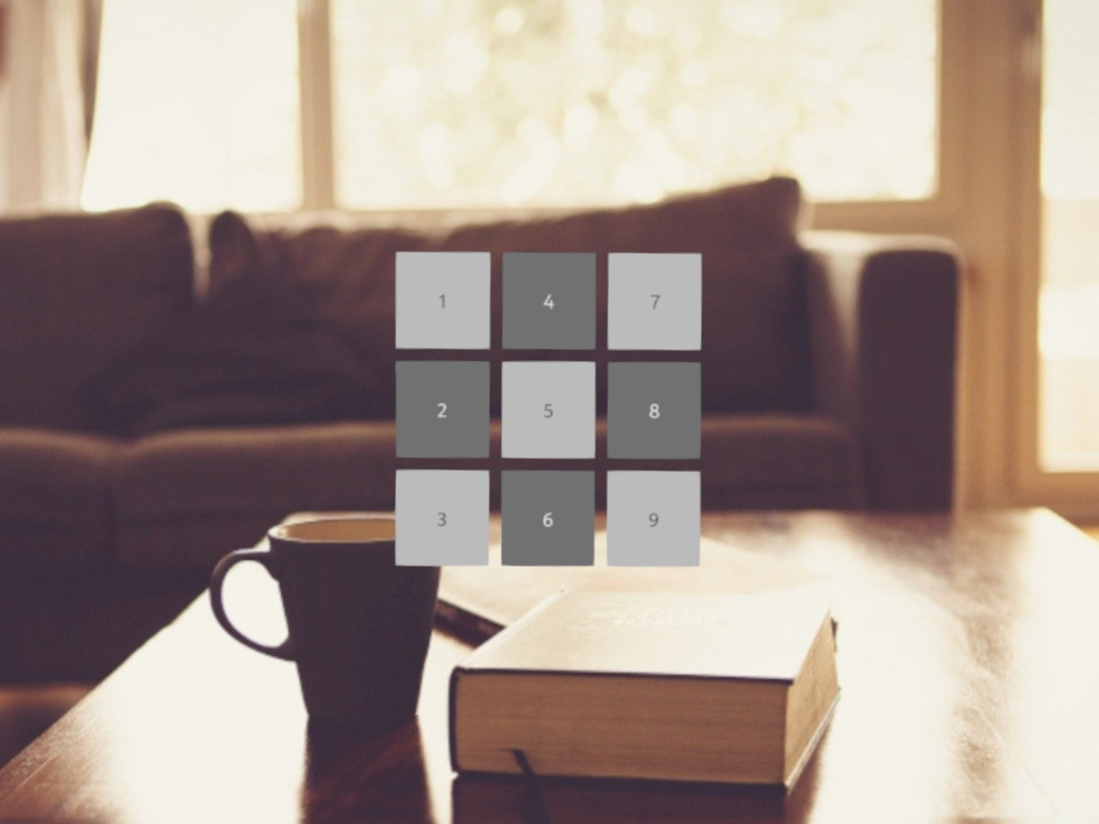
The GridLayout class automatically lays out elements in a grid with optional padding. The grid layout grows to accommodate additional items based on row and column settings. You can constrain the number of columns, rows, or both. If you constrain only one dimension, the other grows as needed. If the layout has an explicit width, then any items added to it shrinks to fit if they are larger than the width of the layout. All units are in meters, including padding.
Example
import React from "react";
import { GridLayout, Text, View, Image, Scene, Prism } from "magic-script-components";
export default class MyApp extends React.Component {
render() {
return (
<Scene>
<Prism size={[1, 1, 0.2]} >
<View name="main-view" alignment={'center-center'}>
<GridLayout alignment={'center-center'} rows={3} defaultItemPadding={[0.02, 0.02, 0.02, 0.02]}>
<View>
<Image color="#7e7e7e" width={0.3} height={0.3} />
<Text text='1' alignment="center-center" textColor="#151515" textSize={0.08} localPosition={[0, 0, 0.02]} />
</View>
<View>
<Image color="#2a2a2a" width={0.3} height={0.3} />
<Text text='2' alignment="center-center" textColor="#bdbdbd" textSize={0.08} localPosition={[0, 0, 0.02]} />
</View>
<View>
<Image color="#7e7e7e" width={0.3} height={0.3} />
<Text text='3' alignment="center-center" textColor="#151515" textSize={0.08} localPosition={[0, 0, 0.02]} />
</View>
<View>
<Image color="#2a2a2a" width={0.3} height={0.3} />
<Text text='4' alignment="center-center" textColor="#bdbdbd" textSize={0.08} localPosition={[0, 0, 0.02]} />
</View>
<View>
<Image color="#7e7e7e" width={0.3} height={0.3} />
<Text text='5' alignment="center-center" textColor="#151515" textSize={0.08} localPosition={[0, 0, 0.02]} />
</View>
<View>
<Image color="#2a2a2a" width={0.3} height={0.3} />
<Text text='6' alignment="center-center" textColor="#bdbdbd" textSize={0.08} localPosition={[0, 0, 0.02]} />
</View>
<View>
<Image color="#7e7e7e" width={0.3} height={0.3} />
<Text text='7' alignment="center-center" textColor="#151515" textSize={0.08} localPosition={[0, 0, 0.02]} />
</View>
<View>
<Image color="#2a2a2a" width={0.3} height={0.3} />
<Text text='8' alignment="center-center" textColor="#bdbdbd" textSize={0.08} localPosition={[0, 0, 0.02]} />
</View>
<View>
<Image color="#7e7e7e" width={0.3} height={0.3} />
<Text text='9' alignment="center-center" textColor="#151515" textSize={0.08} localPosition={[0, 0, 0.02]} />
</View>
</GridLayout>
</View>
</Prism>
</Scene>
);
}
}
Common Events
Common Properties
Element Properties
| Name | Type | Default Value | Required | Description |
|---|---|---|---|---|
| defaultItemAlignment | string | top-left | N | Sets the default item alignment within the grid. The default item alignments are TOP_LEFT. This is set for any new items that are added that don't explicitly specify alignment. The alignment of each individual item can be set later if needed. Note that for the right and the bottom alignments to be visible, the containing cell should be, respectively, wider and higher than its content. |
| defaultItemPadding | vec4 | [0.0, 0.0, 0.0, 0.0] | N | Sets the default padding of each item within the grid, in scene units. The default is no padding (0,0,0,0). The padding order is: top, right, bottom, left. This is set for any new items that are added that don't explicitly specify padding. The padding of each individual item can be set later if needed. Note that padding in a dimension only works for items smaller in that dimension than the cell they are in. Large horizontal padding for an item also contributes to the width of the column the item is in. The same applies for large vertical padding in relation to the height of the row the item is in. |
| itemAlignment | object | n/a | N | Sets the item alignment. Note that for the right and the bottom alignments to be visible, the containing cell should be, respectively, wider and higher than its content. |
| itemPadding | object | n/a | N | Sets the item padding at the specified row and column position. Note that padding in a dimension only works for items smaller in that dimension than the cell they are in. Large horizontal padding for an item will also contribute to the width of the column the item is in. The same applies for large vertical padding in relation to the height of the row the item is in. |
| skipInvisibleItems | boolean | false | N | Skips invisible items. Setting this value to true causes the layout to skip over any invisible items. The layout checks the visibility of each top-level item node added and, if invisible, along with inherited visibility, skips that node for layout. Using this setting affects the displayed grid layout by collapsing the location of invisible items in the grid while the remaining, visible items adjust to fill in those absent locations. |
| columns | number | 0 | N | Sets the number of columns for the grid. The default value of 0 indicates the number of columns can grow to fit items as they are added. Setting the value above 0 locks the grid column dimension. If both rows and columns are set, columns take precedence. If neither rows or columns are set, the grid layout has one row and adds columns as needed. When the number of columns is set, the grid lays items in row-major order. |
| rows | number | 1 | N | Sets the number of rows for the grid. The default value of 0 indicates the number of rows can grow to fit items as they are added. Setting the value above zero locks the grid row dimension. If both rows and columns are set, columns take precedence. If neither rows or columns are set, the grid layout has one row and adds columns as needed. When the number of rows is set (and columns is zero), the grid lays items in column-major order. |
itemAlignment
[{
column: <number>,
row: <number>,
alignment: <string>
}]
itemPadding
[{
column: <number>,
row: <number>,
padding: <vec4>
}]