RectLayout

- Lumin
- iOS
- Android
Description
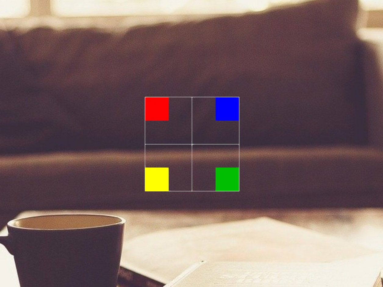
The RectLayout component allows you to automatically layout content within a single rectangular plane with side padding and content alignment. It acts like a table cell when used in conjunction with other layout elements. When you do not specify the rectangle size, or use 0, the rectangle grows to fit the content until it is clipped by the edges of the container. Non-uniform scaling is not recommended. By default, there is no padding and content is aligned to the top left. The padding order is top, right, bottom, left.
The RectLayout sends events only when it is the immediate parent of a UI element. For example, if you have text in a RectLayout, both the text and the RectLayout send onHover events. If you have a text button inside the layout, the layout does not send an onHover event because the parent of the text is the button.
Example
Common Events
Common Properties
Element Properties
| Name | Type | Default Value | Description |
|---|---|---|---|
| contentAlignment | string | top-left | Sets the content alignment within the rectangular area. The default content alignments are TOP_LEFT. When the size of the layout is set to zero in a dimension, it grows in that dimension to fit both the content and its padding, if any. When the size is set to greater than zero, the content might scale down to fit in the room left by the padding. In this case, content alignment is ignored. |
| padding | vec4 | [0.0, 0.0, 0.0, 0.0] | Sets the content padding for the four sides of the rectangular area, in scene units. The default is no padding (0,0,0,0). The padding order is: top, right, bottom, left. When the size of the layout is set to zero in a dimension, it grows in that dimension to fit both the content and its padding, if any. When the size is set to greater than zero, the content might scale down to fit in the room left by the padding. In this case, content alignment is ignored. |