Version: 3.0.0
DatePicker

- Lumin
- iOS
- Android
Description
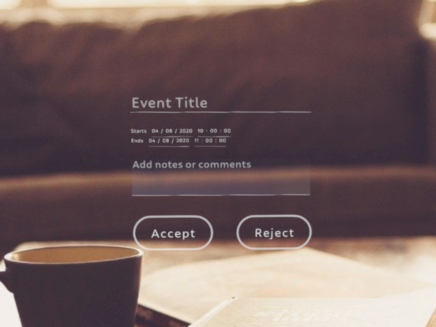
Dialog which allows the user to select date.
Example
import React from 'react';
import { View, DatePicker, Scene, Prism } from 'magic-script-components';
export default class MyApp extends React.Component {
onDateChanged = event => {
// event.Date, event.DateString
console.log("onDateChanged event received: ", event);
};
onDateConfirmed = event => {
// event.Date, event.DateString
console.log("onDateConfirmed event received: ", event);
};
render() {
return (
<Scene>
<Prism size={[1, 1, 0.2]} >
<View name='main-view' alignment={'center-center'} localPosition={[-0.25, 0, 0]}>
<DatePicker
label="Select Date"
labelSide="left"
color={[0.112, 0.655, 0.766, 1]}
defaultDate="03/21/2019"
showHint={false}
height={0.3}
yearMin={1990}
yearMax={2020}
onDateChanged={this.onDateChanged}
onDateConfirmed={this.onDateConfirmed}
/>
</View>
</Prism>
</Scene>
);
}
}
Common Events
Common Properties
Create Properties
| Name | Type | Default Value | Required | Description |
|---|---|---|---|---|
| label | string | n/a | N | The text label that appears with the date picker. |
| labelSide | string | top | N | Side enum specifying whether the label appears on the side or top. Only top and left are currently supported. |
| defaultDate | string | (current DateTime) | N | The default date to appear on the date picker instead of the placeholder strings. |
| yearMin | number | -1 | N | The minimum year available to choose from. |
| yearMax | number | -1 | N | The maximum year available to choose from. |
| dateFormat | string | MM/DD/YYYY | N | Format of date complies with DateFormat |
LabelSide values:
- bottom
- left
- right
- top
Element Properties
| Name | Type | Default Value | Description |
|---|---|---|---|
| color | vec4 | N/A | Sets the DatePicker component's color. This does not affect the label. |
| date | string | N/A | Sets the date manually. This only has an affect when not currently focused. |
| showHint | boolean | false | To show the selected Date eg. 01/01/2019 or the format hint eg. MM/DD/YYYY. This will only have an affect when not currently focused. The full hint is always displayed on creation. Each field will continue to show the hint, ie MM or DD or YYYYY, until that field is focused. This can override that behavior and display the Date immediately if desired. The full Date will be shown when the user confirms a selected Date. |