Version: 3.0.0
ScrollView
- Lumin
- iOS
- Android
Description
The ScrollView component represents a scrollable content view so objects, such as images or text, can overflow the viewable area. The ScrollView creates a 3D box that you specify a minimum and maximum corner that contains all of your content. The scroll bounds sets the viewable area (AABB) of the 3D box. Content outside the scroll bounds is clipped. You can scroll horizontally, vertically, or both. When scrolling, the cursor snaps to contents of the scroll view when gravity wells and snap are enabled.
By default, the scroll view is the size of your prism and scrolls vertically with a .5f scroll rate and a 2.0f activity duration.
Example
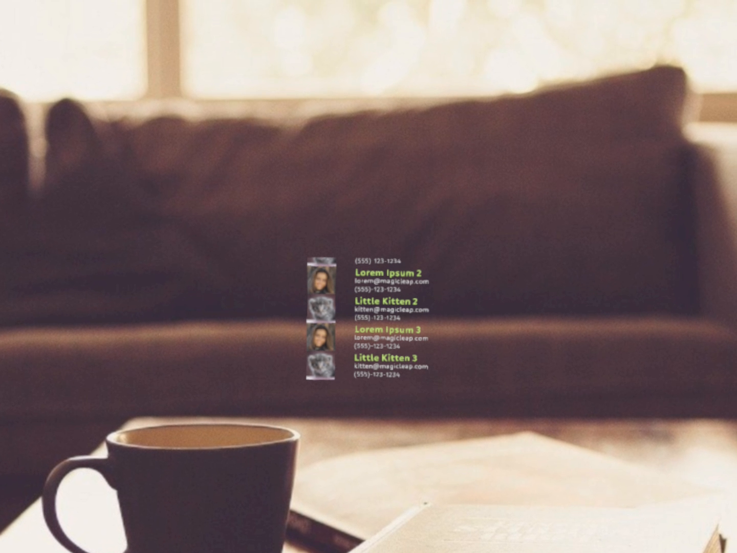
import React from "react";
import {
View,
ScrollView,
ScrollBar,
Text,
LinearLayout,
RectLayout,
Image,
Prism,
Scene
} from "magic-script-components";
export default class MyApp extends React.Component {
render() {
const contacts = [
{ name: 'Lorem Ipsum ', email: 'lorem@magicleap.com ', image: require('../../resources/contact1.jpg'), phone: '(555)-123-1234' },
{ name: 'Little Kitten ', email: 'kitten@magicleap.com', image: require('../../resources/contact2.jpg'), phone: '(555)-123-1234' },
{ name: 'Lorem Ipsum 2 ', email: 'lorem@magicleap.com ', image: require('../../resources/contact1.jpg'), phone: '(555)-123-1234' },
{ name: 'Little Kitten 2', email: 'kitten@magicleap.com', image: require('../../resources/contact2.jpg'), phone: '(555)-123-1234' },
{ name: 'Lorem Ipsum 3 ', email: 'lorem@magicleap.com ', image: require('../../resources/contact1.jpg'), phone: '(555)-123-1234' },
{ name: 'Little Kitten 3', email: 'kitten@magicleap.com', image: require('../../resources/contact2.jpg'), phone: '(555)-123-1234' }
];
const aabb = {
min: [-0.3, -0.2, -0.3],
max: [0.3, 0.15, 0.3]
};
return (
<Scene>
<Prism size={[1, 1, 1]} >
<View name="main-view" alignment={'center-center'}>
<ScrollView scrollBarVisibility="auto" scrollBounds={aabb}>
<ScrollBar length={0.6} thumbSize={0.03} orientation="vertical" />
<LinearLayout
defaultItemAlignment="center-left"
orientation="vertical"
>
{contacts.map((contact, index) => (
<RectLayout key={contact.name} width={0.35} contentAlignment={'top-left'}>
<View>
<Image localPosition={[0, 0, 0]} height={0.17} width={0.17} filePath={contact.image} />
<Text localPosition={[0.2, 0.05, 0]} alignment={'center-left'} textSize={0.07} weight={"bold"} textColor={"#85D834"} >
{contact.name}
</Text>
<Text localPosition={[0.2, 0, 0]} alignment={'center-left'} textSize={0.05} textColor={"#e0e0e0"} >
{contact.email}
</Text>
<Text localPosition={[0.2, -0.05, 0]} alignment={'center-left'} textSize={0.05} textColor={"#B5B5B5"}>
{contact.phone}
</Text>
</View>
</RectLayout>
))}
</LinearLayout>
</ScrollView>
</View>
</Prism>
</Scene>
);
}
}
Common Events
Common Properties
Element Properties
| Name | Type | Default Value | Description |
|---|---|---|---|
| scrollBarVisibility | string | auto | Sets the visibility mode of any attached scrollbars. The visibility mode affects the visibility of any attached scroll bars. |
| scrollDirection | string | vertical | Sets the scroll direction for the scroll view. The default is vertical. |
| scrollMask | number | n/a | Applies the texture resource as a mask for ScrollView content. |
| scrollOffset | vec3 | n/a | Sets the scroll content offset manually. |
| scrollSpeed | number | 0.1 | Sets the scroll speed in scene units per second. |
| scrollValue | number | 0 | Sets the scroll content position manually with a normalized value between 0 and 1. |
| scrollBounds | object | n/a | Sets the scroll bounds. The bounds are defined within the ScrollView's local coordinate system. The scroll bounds is used to both clip content visually and to automatically clamp content scrolling extents to stay within the bounds. |
scrollBounds
{
min: <vec3>,
max: <vec3>
}