Version: 3.0.0
TimePicker

- Lumin
- iOS
- Android
Description
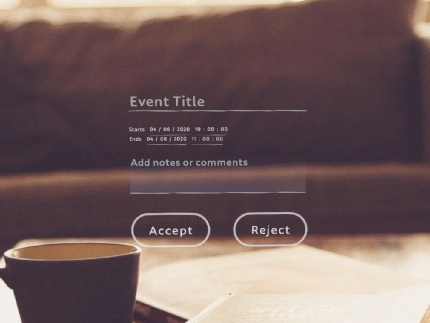
The TimePicker component is a dialog that allows the user to select a time.
Example
import React from "react";
import { View, TimePicker, TextEdit, DatePicker, LinearLayout, Button, Scene, Prism } from "magic-script-components";
export default class MyApp extends React.Component {
constructor(props) {
super(props);
const date = new Date();
const startHour = date.getHours() + 1
const endHour = date.getHours() + 2
this.state = { startTime: startHour + ":00:00", endTime: endHour + ":00:00" };
}
onDateConfirmed = event => {
// event.Date, event.DateString
console.log("onDateConfirmed event received: ", event);
};
onTimeConfirmed = event => {
// event.Time, event.TimeString
console.log("onTimeConfirmed event received: ", event);
};
render() {
const { startTime, endTime } = this.state
return (
<Scene>
<Prism size={[1, 1, 0.2]} >
<LinearLayout
name="main-view"
localPosition={[0, 0, 0]}
alignment="center-center"
itemPadding={[
{ index: 0, padding: [0, 0, 0.06, 0] },
{ index: 2, padding: [0, 0, 0.04, 0] },
{ index: 3, padding: [0, 0, 0.08, 0] },
]}>
<TextEdit hint='Event Title' height={0.075} textSize={0.07} width={0.7} />
<LinearLayout orientation="horizontal">
<DatePicker label="Starts" labelSide="left" showHint={false} onDateConfirmed={this.onDateConfirmed} />
<TimePicker labelSide="left" time={startTime} timeFormat={"HH:MM p"} showHint={false} onTimeConfirmed={this.onTimeConfirmed} />
</LinearLayout>
<LinearLayout orientation="horizontal">
<DatePicker label="Ends" labelSide="left" showHint={false} onDateConfirmed={this.onDateConfirmed} />
<TimePicker labelSide="left" time={endTime} timeFormat={"HH:MM p"} showHint={false} onTimeConfirmed={this.onTimeConfirmed} />
</LinearLayout>
<TextEdit hint='Add notes or comments' multiline={true} height={0.15} textSize={0.05} width={0.7} />
<View>
<Button localPosition={[-0.2, 0, 0]} text="Accept" textSize={0.06} roundness={1} />
<Button localPosition={[0.2, 0, 0]} text="Reject" textSize={0.06} roundness={1} />
</View>
</LinearLayout>
</Prism>
</Scene>
);
}
}
Common Events
Common Properties
Create Properties
| Name | Type | Default Value | Required | Description |
|---|---|---|---|---|
| label | string | n/a | N | The text label that appears with the TimePicker. |
| labelSide | string | top | N | Side enum specifying whether the label appears on the side or top. Only top and left are currently supported. |
| defaultTime | string | (current Time) | N | The default time to set for the TimePicker. |
LabelSide values:
- bottom
- left
- right
- top
Element Properties
| Name | Type | Default Value | Description |
|---|---|---|---|
| color | string | Sets the TimePicker component's color. This doesn't affect the label. | |
| time | number | Sets the time. This ignores values that aren't in hh:mm:ss format. | |
| showHint | boolean | To show the selected Time eg. 12:30:00 or the format hint eg. hh:mm:ss. This will only have an affect when not currently focused. The full hint is always displayed on creation. Each field will continue to show the hint, eg. hh or mm or ss, until that field is focused. This can override that behavior and display the Time immediately if desired. The full Time will be shown when the user confirms a selected Time. |