Version: 3.0.0
ProgressBar
- Lumin
- iOS
- Android
Description
The ProgressBar component is used to show the progress of an event. By default, the component creates a horizontal progress bar. You cannot modify the progress bar size after you create it.
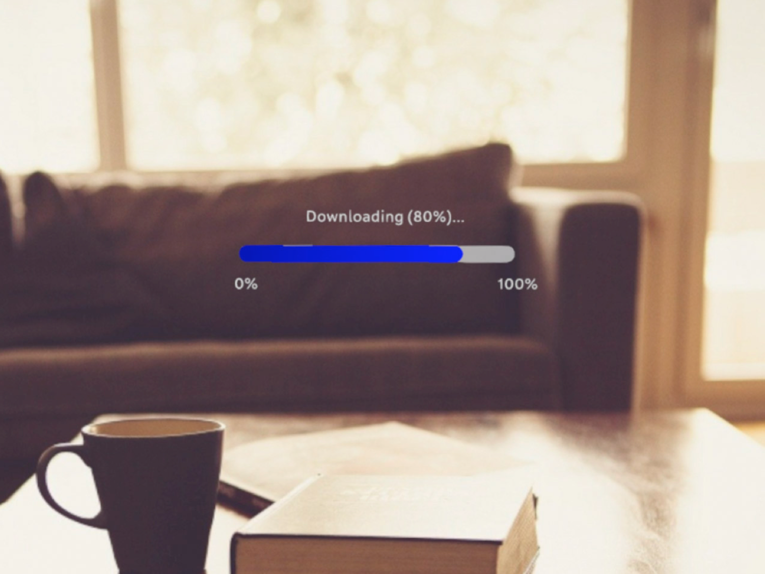
Example
import React from "react";
import { View, ProgressBar, Text, Prism, Scene } from "magic-script-components";
export default class MyApp extends React.Component {
render() {
const colors = {
beginColor: 'navy',
endColor: 'blue'
};
return (
<Scene>
<Prism size={[1, 1, 0.2]} >
<View name="main-view" alignment={'center-center'}>
<Text localPosition={[-0.13, 0.05, 0]} textSize={0.035}>Downloading (80%)...</Text>
<ProgressBar
width={0.5}
height={0.03}
min={0}
max={100}
value={80}
progressColor={colors}
/>
<Text localPosition={[-0.26, -0.07, 0]} textSize={0.035}>0%</Text>
<Text localPosition={[0.22, -0.07, 0]} textSize={0.035}>100%</Text>
</View>
</Prism>
</Scene>
);
}
}
Common Events
Common Properties
Create Properties
| Name | Type | Default Value | Required | Description |
|---|---|---|---|---|
| width | number | n/a | The width of the progress bar. | |
| height | number | n/a | 0 | The height of the progress bar, 0 for default. |
Element Properties
| Name | Type | Default Value | Description |
|---|---|---|---|
| min | number | 0 | Sets the progress bar minimum value. Default value for min is 0. The minimum value is set only if it is less than the progress bar's maximum value. |
| max | number | 0 | Sets the progress bar maximum value. Default value for max is 1. The maximum value is set only if it is greater than the progress bar's minimum value. |
| value | number | 0 | Sets the progress bar value. The value is constrained within the current min and max range. |
| progressColor | object | <white, white> | Sets the progress bar indicator color. |
progressColor
{
beginColor: <vec4>,
endColor: <vec4>
}