Version: latest
ListView
- Lumin
- iOS
- Android
Description
The ListView is a scrollable, selectable list of items. It adds a background quad to the items, including padding. Items can be grouped in horizontal or vertical lists.
Example
import React from "react";
import {
ListView,
ListViewItem,
Text,
Image,
View,
RectLayout,
ScrollBar,
Scene,
Prism
} from "magic-script-components";
export default class MyApp extends React.Component {
render() {
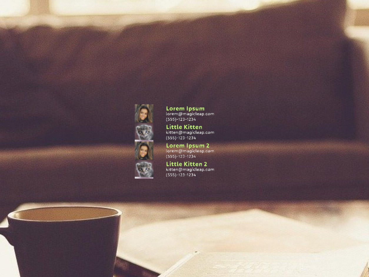
const contacts = [
{ name: 'Lorem Ipsum ', email: 'lorem@magicleap.com ', image: require('../../resources/contact1.jpg'), phone: '(555)-123-1234' },
{ name: 'Little Kitten ', email: 'kitten@magicleap.com', image: require('../../resources/contact2.jpg'), phone: '(555)-123-1234' },
{ name: 'Lorem Ipsum 2 ', email: 'lorem@magicleap.com ', image: require('../../resources/contact1.jpg'), phone: '(555)-123-1234' },
{ name: 'Little Kitten 2', email: 'kitten@magicleap.com', image: require('../../resources/contact2.jpg'), phone: '(555)-123-1234' },
{ name: 'Lorem Ipsum 3 ', email: 'lorem@magicleap.com ', image: require('../../resources/contact1.jpg'), phone: '(555)-123-1234' },
{ name: 'Little Kitten 3', email: 'kitten@magicleap.com', image: require('../../resources/contact2.jpg'), phone: '(555)-123-1234' }
];
return (
<Scene>
<Prism size={[1, 1, 0.2]} >
<View name="main-view" alignment={'center-center'}>
<ListView localPosition={[0, 0, 0]} width={0.7} height={0.5} defaultItemAlignment={'top-left'} defaultItemPadding={[0, 0, 0.01, 0]}>
<ScrollBar length={0.5} thumbSize={0.03} />
{contacts.map((contact, index) => (
<ListViewItem key={index}>
<RectLayout width={0.35} contentAlignment={'top-left'}>
<View>
<Image localPosition={[0, 0, 0]} height={0.17} width={0.17} filePath={contact.image} />
<Text localPosition={[0.2, 0.05, 0]} alignment={'center-left'} textSize={0.07} weight={"bold"} textColor={"#85D834"} >
{contact.name}
</Text>
<Text localPosition={[0.2, 0, 0]} alignment={'center-left'} textSize={0.05} textColor={"#e0e0e0"} >
{contact.email}
</Text>
<Text localPosition={[0.2, -0.05, 0]} alignment={'center-left'} textSize={0.05} textColor={"#B5B5B5"}>
{contact.phone}
</Text>
</View>
</RectLayout>
</ListViewItem>
))}
</ListView>
</View>
</Prism>
</Scene>
);
}
}
Common Events
Common Properties
Create Properties
| Name | Type | Default Value | Required | Description |
|---|---|---|---|---|
| width | number | 0 | N | The width of the list view. The default (0) allows the list to grow as needed. |
| height | number | 0 | N | The height of the list view. The default (0) allows the list to grow as needed. |
Element Properties
| Name | Type | Default Value | Description |
|---|---|---|---|
| cursorEdgeScrollMode | string | n/a | Sets the cursor edge scroll mode for this list view. |
| defaultItemAlignment | string | top-left | Sets the default item alignment within the list. Default item alignments are TOP_LEFT. This is set for any new items that are added that don't explicitly specify alignment. The alignment of each individual item can be set later if needed. |
| defaultItemPadding | vec4 | [0.0, 0.0, 0.0, 0.0] | Sets the default padding of each item within the list, in scene units. The default is no padding (0,0,0,0). The padding order is: top, right, bottom, left. This is set for any new items that are added that don't explicitly specify padding. The padding of each individual item can be set later if needed. |
| orientation | string | vertical | Sets the orientation of this list view. The default orientation is Vertical. |
| scrollBarVisibility | string | always | Sets the visibility mode of the scrollbars attached. |
| scrollingEnabled | boolean | true | Sets whether list view scrolling is enabled or not. |
| scrollSpeed | number | 0.1 | Sets the scroll speed in scene units per second. |
| scrollValue | number | 0 | Sets the scroll content position manually with a normalized value between 0 and 1. |
| scrollToItem | number | n/a | Sets the index of the item you would like to scroll to. |
| skipInvisibleItems | boolean | false | Skips invisible items. Setting this value to true causes the layout to skip over any invisible items. The layout checks the visibility of each top-level item node added and, if invisible, along with inherited visibility, skips that node for layout. |
| itemAlignment | object | n/a | Sets the item alignment at the specified index. |
| itemPadding | object | n/a | Sets the item padding at the specified index. |
itemAlignment
[{
index: <number>,
alignment: <string>
}]
itemPadding
[{
index: <number>,
padding: <vec4>
}]
cursorEdgeScrollMode options: CursorEdgeScrollMode
defaultItemAlignment options: Alignment
orientation options: Orientation
scrollBarVisibility options: ScrollBarVisibility
itemAlignment.alignment options: Alignment
Events
- onScrollChanged