Version: latest
Panel
- Lumin
- iOS
- Android
Description
The Panel component organizes two or more elements, transforms descendants within its bounds, and affects the cursor. Panels can also use gravity wells to lightly constrain the cursor within the panel. Panels can parent other panels or be in a layout with other panels. Use Panels when your app needs high-level or visual navigation clues or when you need a way to navigate between locations or purposes. Use subpanels when you want to visually separate or sort groups of similar content or group content to receive the same transforms. By default, a Panel creates a 2D square that is centered on the parent node's position.
Example
import React from "react";
import { View, Panel, Button, Scene, Prism } from "magic-script-components";
export default class MyApp extends React.Component {
render() {
const aShape = {
size: [0.4, 0.4],
offset: [0, 0, 0],
roundness: 0.2
};
const bShape = {
size: [0.4, 0.4],
offset: [0, 0, 0],
roundness: 0.8
};
return (
<Scene>
<Prism size={[1, 1, 0.2]} >
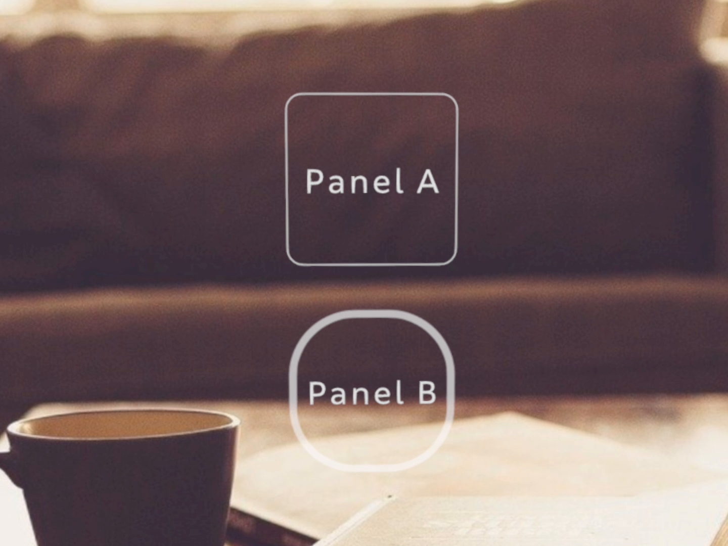
<View name="main-view" alignment={'center-center'}> <Panel
localPosition={[0, 0.25, 0]}
panelShape={aShape}
cursorTransitionType="closest-edge"
cursorVisible={true}
>
<Button
text="Panel A"
textSize={0.1}
roundness={aShape.roundness}
width={aShape.size[0]}
height={aShape.size[1]}
/>
</Panel>
<Panel
localPosition={[0, -0.25, 0]}
panelShape={bShape}
cursorTransitionType="center"
cursorVisible={false}
>
<Button
text="Panel B"
textSize={0.1}
roundness={bShape.roundness}
width={aShape.size[0]}
height={aShape.size[1]}
/>
</Panel>
</View>
</Prism>
</Scene>
);
}
}
Common Events
Common Properties
Element Properties
| Name | Type | Default Value | Description |
|---|---|---|---|
| cursorConstrained | boolean | false | Sets whether the panel constrains cursor movement within the boundary shape or not. |
| cursorInitialPosition | vec3 | (0,0,0) | Sets the initial position of the cursor within the panel upon a Panel-to-Panel transition when PanelCursorTransitionType 'initial-position' is in affect. |
| cursorTransitionType | string | initial-position | Sets the cursor transition type for the panel. The cursor transition type dictates where the cursor appears upon a panel transition, such as the closest edge, center, or initial position. The default is the initial position. |
| cursorVisible | boolean | true | Sets whether the cursor is visible while inside the <Panel>. |
| edgeConstraint | object | n/a | Sets the edge constraint and panel transition properties for a side of the panel shape. |
| edgeConstraintLevel | object | n/a | Sets the edge constraint for a side of the panel shape using a discrete constraint level. Panel edge constraint levels are mapped to a float magnitude and can be used for a consistent setting instead of setting the magnitude manually. |
| panelShape | object | n/a | Sets the boundary shape for the panel. The panel is not active until the shape is set. |
| side | string | n/a | Sets the side of the boundary shape. |
edgeConstraint
{
side: <string>,
constraintMagnitude: <number>
}
edgeConstraintLevel
{
side: <string>,
level: <string>
}
panelShape
{
size: <vec2>,
offset: <vec3>,
roundness: <number>
}