Version: latest
Toggle
- Lumin
- iOS
- Android
Description
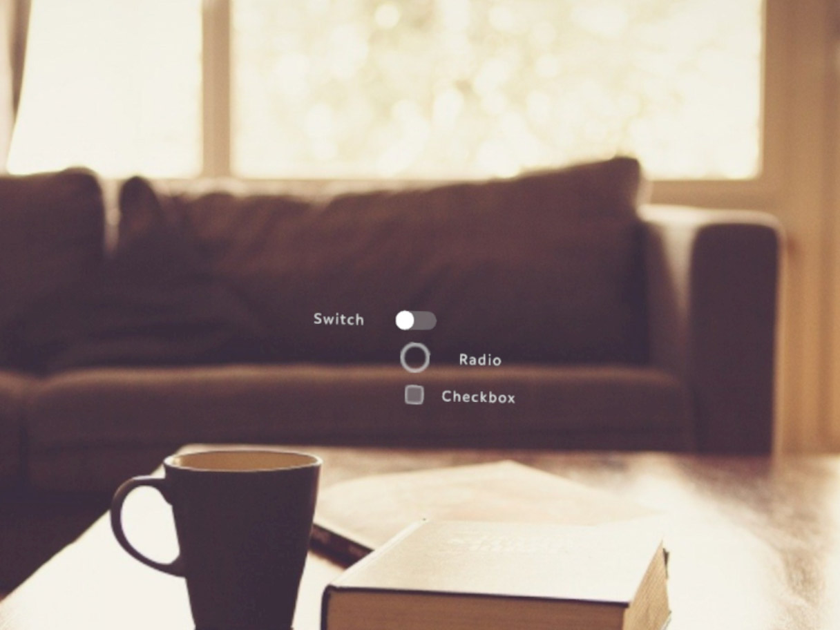
Toggle creates a two option, toggleable element. Toggles are generally used in app menus or as action buttons. Toggles can be grouped together and depend on the state of a parent toggle. If the parent toggle is off, the descendent toggles are usually disabled.
Example
import React from "react";
import { View, Toggle, Scene, Prism } from "magic-script-components";
export default class MyApp extends React.Component {
onSwitchHandler = eventData => {
};
render() {
return (
<Scene>
<Prism size={[1, 1, 0.2]} >
<View name="main-view" alignment={'center-center'}>
<Toggle
localPosition={[0, 0.1, 0]}
text="Switch"
type="default"
height={0.05}
textSize={0.05}
onToggleChanged={this.onSwitchHandler}
/>
<Toggle
localPosition={[0, 0, 0]}
text="Radio"
type="radio"
height={0.08}
textSize={0.05}
onToggleChanged={this.onSwitchHandler}
/>
<Toggle
localPosition={[0, -0.1, 0]}
text="Checkbox"
type="checkbox"
height={0.05}
textSize={0.05}
onToggleChanged={this.onSwitchHandler}
/>
</View>
</Prism>
</Scene>
);
}
}
Common Events
Common Properties
Create Properties
| Name | Type | Default Value | Required | Description |
|---|---|---|---|---|
| text | string | n/a | N | The UTF-8 encoded text to initially set the Toggle label to. |
| type | string | default | N | The type of the toggle, can be either default, radio or checkbox. The default stands for switch type. |
| height | string | 0.0 | N | The height of the toggle, 0 for default. |
Element Properties
| Name | Type | Default Value | Description |
|---|---|---|---|
| on | boolean | false | Sets whether the toggle state is ON. |